.07
reflection
throughout the course of this project, i learned so much. it was my first time using figma, so there were a lot of learning curves. thankfully, i had an amazing professor/mentor who gave me the best advice i’ve receive since, which was to have humility when it comes to designing.
knowing that it’s okay to make mistakes allowed me to have so much more creative freedom with my designs. what matters most is not to get attached to your designs and to be able to acknowledge when a design doesn’t fulfill it’s potential.
overall, with this project, i was able to develop not only my design skills but also my user empathy. learning to take a step back and analyze how the product is or isn’t helping the user and being able to pin point user pain points within the interface has made me a better designer.
.06
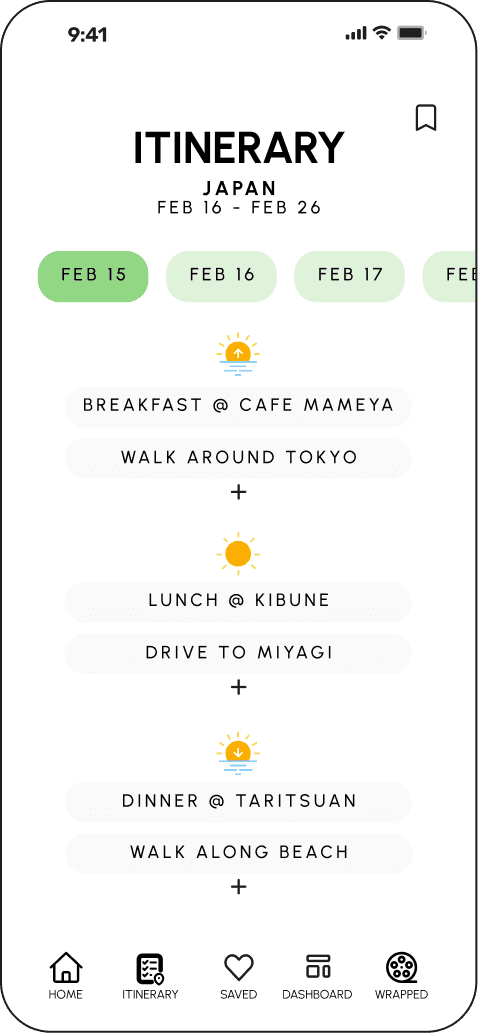
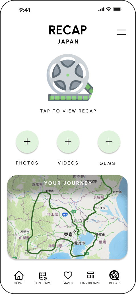
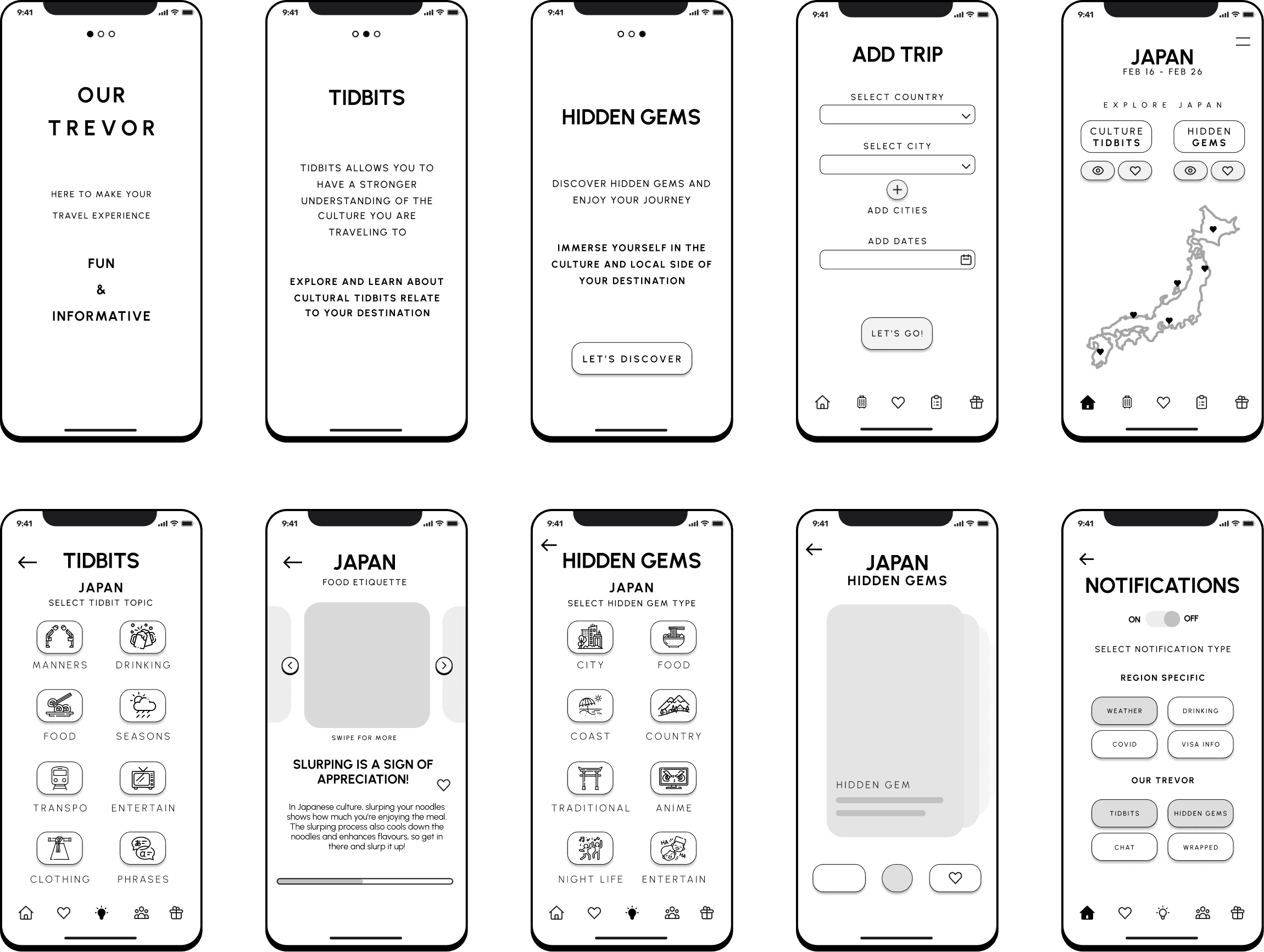
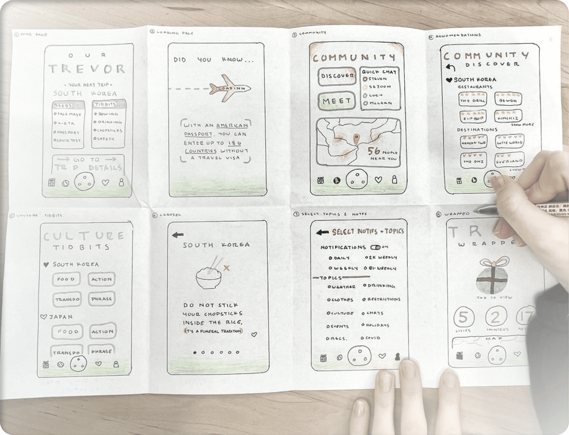
final hi-fi designs
after making the adjustments necessary to our design, it was time to deliver.
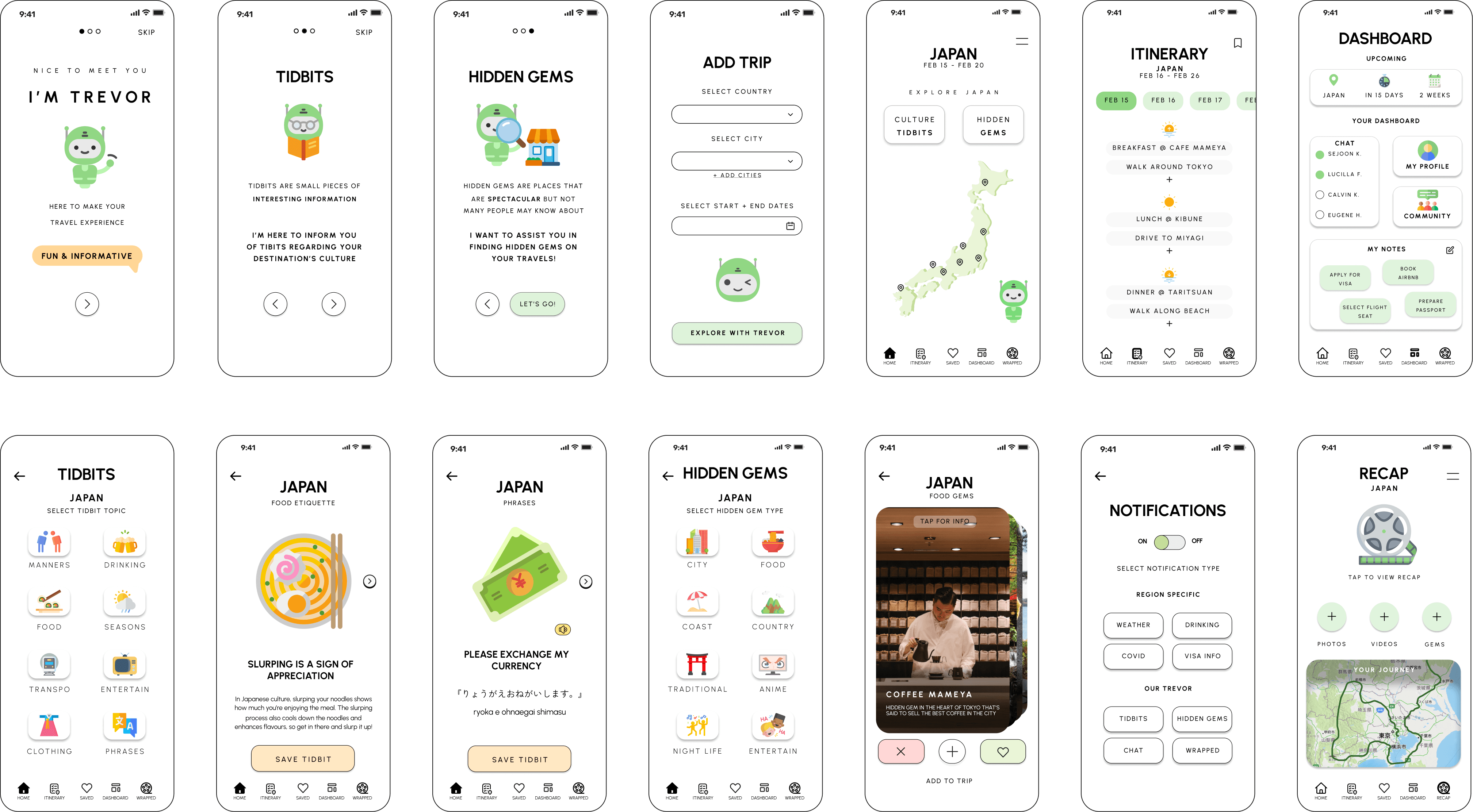
PROVIDES SIMPLE HOME NAVIGATION TO THE KEY PAGES OF THE SYSTEM
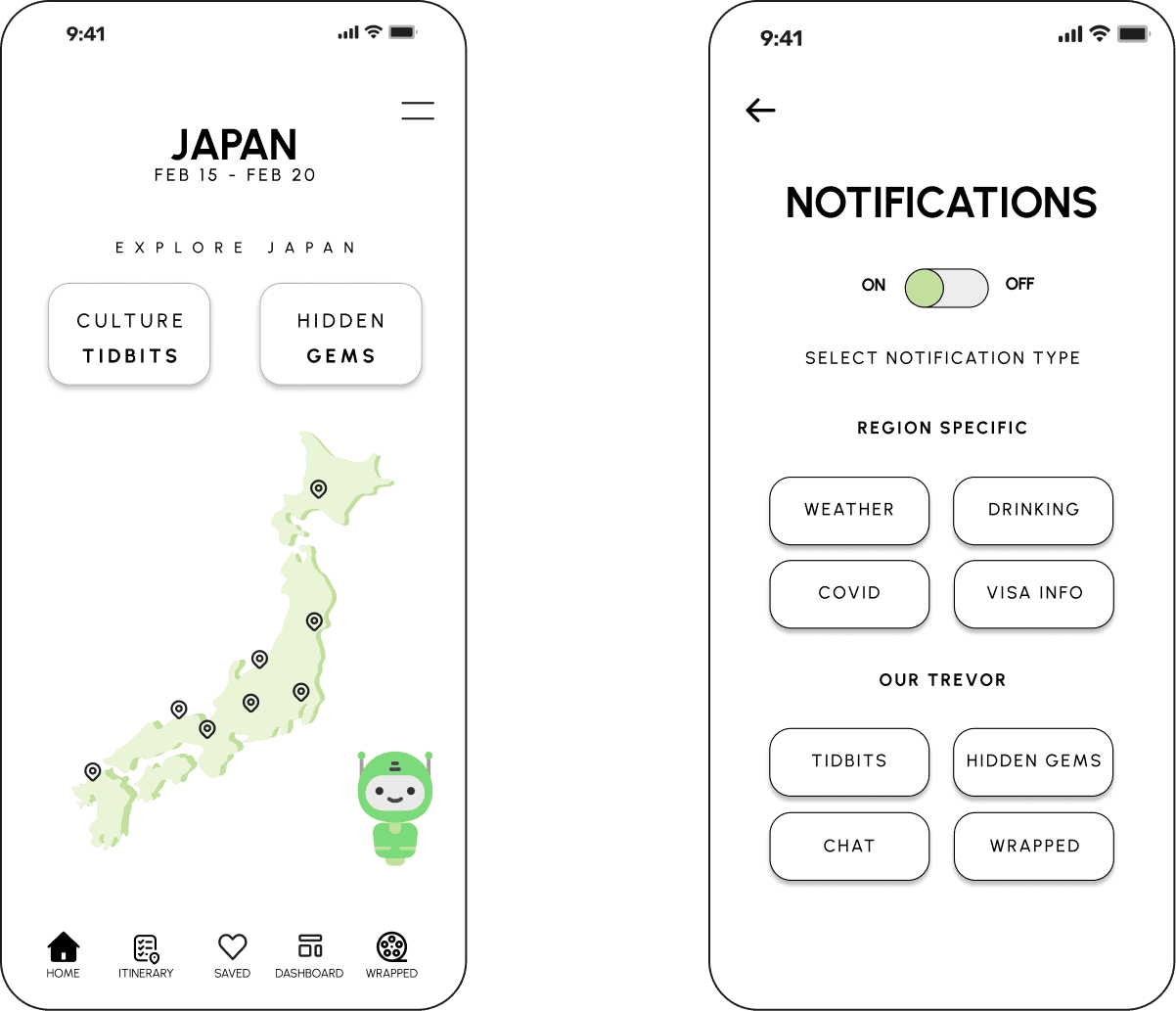
INFORMS USERS ON CULTURAL FACTS ABOUT THE REGION THAT THEY WILL BE TRAVELING TO
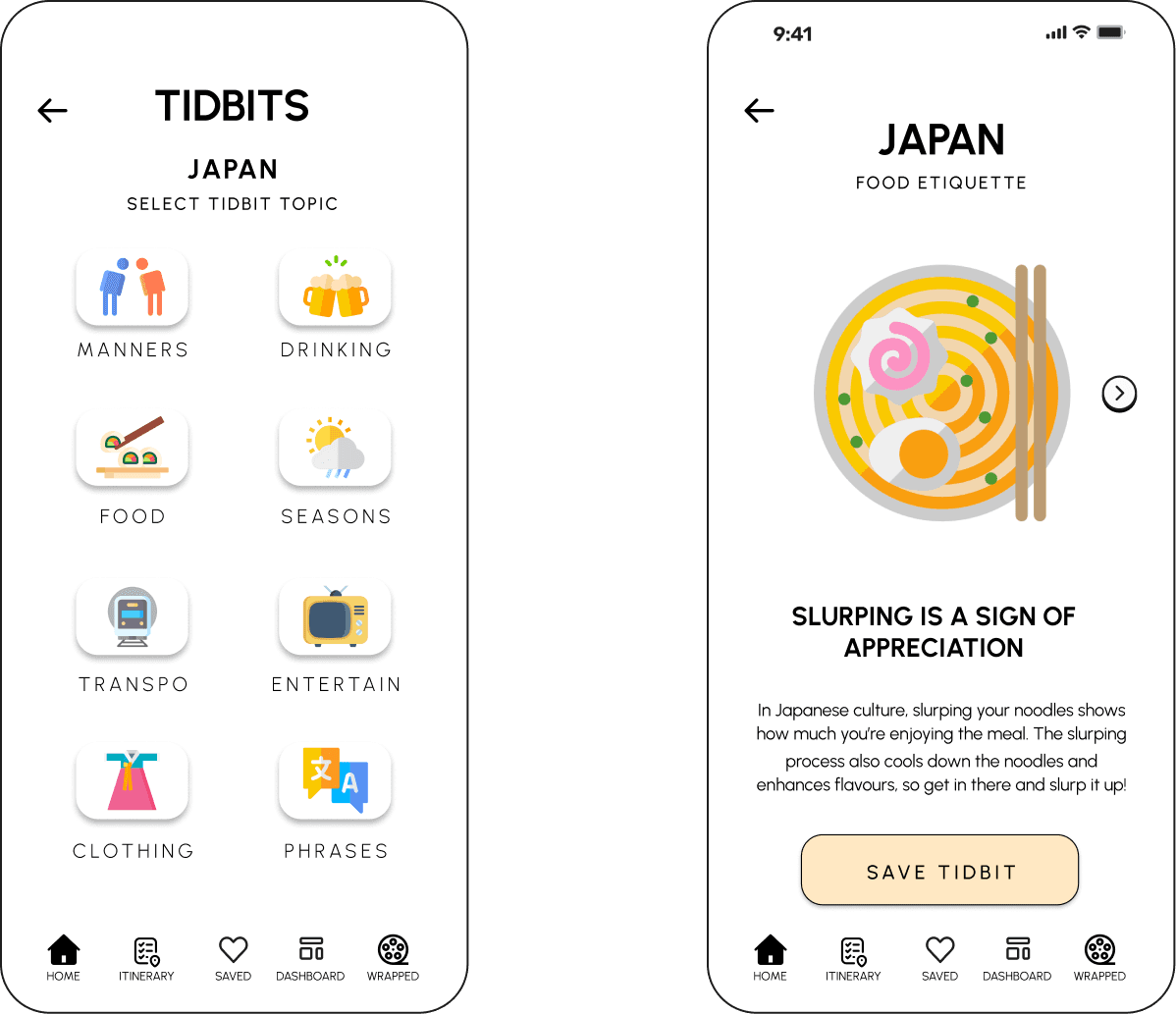
PROVIDES USERS WITH AN ASSORTMENT OF HIDDEN GEMS IN THE COUNTRY THEY ARE TRAVELING TO
ALLOWS USERS TO ORGANIZE AN ITINERARY FOR THERE TRIP IN AN EASY-TO-UNDERSTAND WAY
allows users to CONNECT with THEIR FRIENDS, AND ALLOWS THEM TO TAKE NOTES AS prepare to travel
ALLOWS USERS TO RECAP ON THEIR JOURNEY BY UPLOADING AND VIEWING THEIR EXPERIENCES AT THE END the trip
user CAN ALSO ADJUST their NOTIFICATIONS TO FIT their NEEDS
COVERS MANY TOPICS AND HELPS WITH PHRASES FOR USERS TO LEARN
USERS CAN SAVE, DISCARD, OR ADD EACH HIDDEN GEM TO THEIR TRIP
EASY ACCESS TO SAVED HIDDEN GEMS FOR A QUICK ADD TO TRIP PROCESS
ALSO ALLOWS USERS TO GET A QUICK VIEW OF THEIR UPCOMING TRIP
THE USER CAN ALSO ACCESS A FOOT PATH OF where they journeyed
key feature screens
.01
.02
.03
.04
.05
.06
home screen
tidbits
hidden gems
itinerary
dashboard
trevor recap

.05
user testing
going into user testing, we developed a script and basic testing outline of what insights we wanted from the user.
the major pain points that our testers wanted adjusted included making the icons more obvious, simplify prototyping, more clear hierarchy of actions the user needs to take, and to make sure the design is not too simple.
after making the adjustments necessary to our design, it was time to deliver.
my TEAM CONDUCTED BOTH IN PERSON AND VIRTUAL USER TESTS. FROM THESE TESTS, OUR KEY TAKEAWAYS PERTAINED TO THE UI DESIGN, AND POTENTIAL FEATURES THAT USERS MIGHT WANT.


.04
wireframes
getting into the design process, i wanted to focus on a simple user interface with a clear user flow. we started the process my developing low fidelity screens, and ending the process with our high fidelity screens.
with a clear userflow in mind, it made designing the screens a lot easier since i had an idea of the content that will need to be displayed. now that we have the userflow, its time to start designing.
for our interface, we focused on a trip to japan. our main screens consist of an onboarding process, home screen, ‘tidbits’, ‘hidden gems’, and notification screen. with our basic concept down, we went into concept testing.
i started by hand drawing basic ideas for our potential screens. by just getting ideas to paper allowed for us to even further flesh out our screens and ui design.
where we started
first, userflow
then, lo-fi screens

.03
MARKET RESEARCH
once we had a better understanding of our problem space, we dove into our market research to have a more quantitive understanding of our target market.
with this research, we were able to see that post-quarantine, travelers were starting to go back to International travel and looking to travel for solo relaxation.
48%
rise in solo travel in america in 2023
280%
more foreigners traveling in europe
58%
of millennials prefer yolo travel style
51%
of gen z prefer a relaxing travel style
.02
UNDERSTANDING USERS
i find it important to understand who you are designing for before you start designing. this will help the team have a better understanding of their audience going into the design process
the key takeaways from this exercise is that we were able to clearly understand that a major pain point in international travel is the fear or worry of accidentally doing something not culturally appropriate and offending the people in that country.
after understanding the user journey within the traveling process, my team and I were able to get a more well-rounded understanding of what the potential user want and need from our product.
we focused on analyzing the four major stages in the traveling process
empathy exercise
know, feel, do
timed exercise that helps breakdown what the potential user would know about the problem space, feel about the topic, and do in the situation.
NOW, LETS LOOK AT THE JOURNEY
before trip
at airport
during trip
after trip
what to pack
documentation
culture shock
reminisce
any restrictions?
flight info
what to do
leave reviews
language study
currency change
hidden gems
plan next trip

.01
the problem
MAJORITY OF PEOPLE ARE MILLENNIALS AND GEN X PREFER TO RELAX WHILE TRAVELING. there is also a RISE IN PEOPLE BEGINNING TO EXPLORE THE WORLD POST-PANDEMIC. however, an OVERWHELMING AMOUNT OF INFORMATION such as language and cultural differences CAN PUSH PEOPLE AWAY FROM LEARNING ABOUT UNFAMILIAR CULTURES.
.00
overview
how might we...
PROVIDE INFORMATION TO USERS THROUGH TIDBITS AND HIDDEN GEMS TO ALLOW THEM TO FEEL CULTURALLY AWARE AND EXCITED for THEIR JOURNEY?
our process
discover
design
analyze
deliver
understand problem space and user pain points
prototype interface and designate screens
user test and understand pain points
finalize hi-fi designs and brand strategy
Many globetrotters face challenges in understanding unfamiliar cultures and discovering hidden gems during their travels. Enhancing cultural awareness in new regions can boost confidence and comfort on journeys while uncovering hidden gems enhances the overall travel experience. we sought to assist users on their adventures.

Our Trevor
a mobile application that provides cultural awareness to travelers
product design | winter 2023
timeline
10 weeks
team
sejoon kim
my role
ux/ui design lead
brand strategy
tools
figma
miro
skills
market research
info arch
design system