.07
reflection
throughout the course of this project, I grew a lot as a designer. taking on the title of visual lead came with a lot of responsibilities. with some experience under my belt, and an amazing team, I feel confident in the final designs from this process. if I could do it again, I wouldn't change a thing.
there were many challenges, however. the design process is never glitter and rainbows, and this project was no different. especially since my teammates were all my closest friends, communication became tough out of fear of hurting the other's feelings. however, we rallied together not only as teammates but friends and worked through our hard times to come out on the other side with an amazing project.
overall, with this project, i was able to further develop both my design skills as well as my leadership skills. i find its important for designers to have a strong sense of leadership and compassion, so they know when to stand for their idea and when to back down. that being said, i can’t wait to grow more as a designer in coming projects.
.06
final designs
before we fully started designing our high-fidelity screens, we first wanted to set the mood and style with some guidelines.
with all of guides and styles set, i lead my team through this exciting design process.
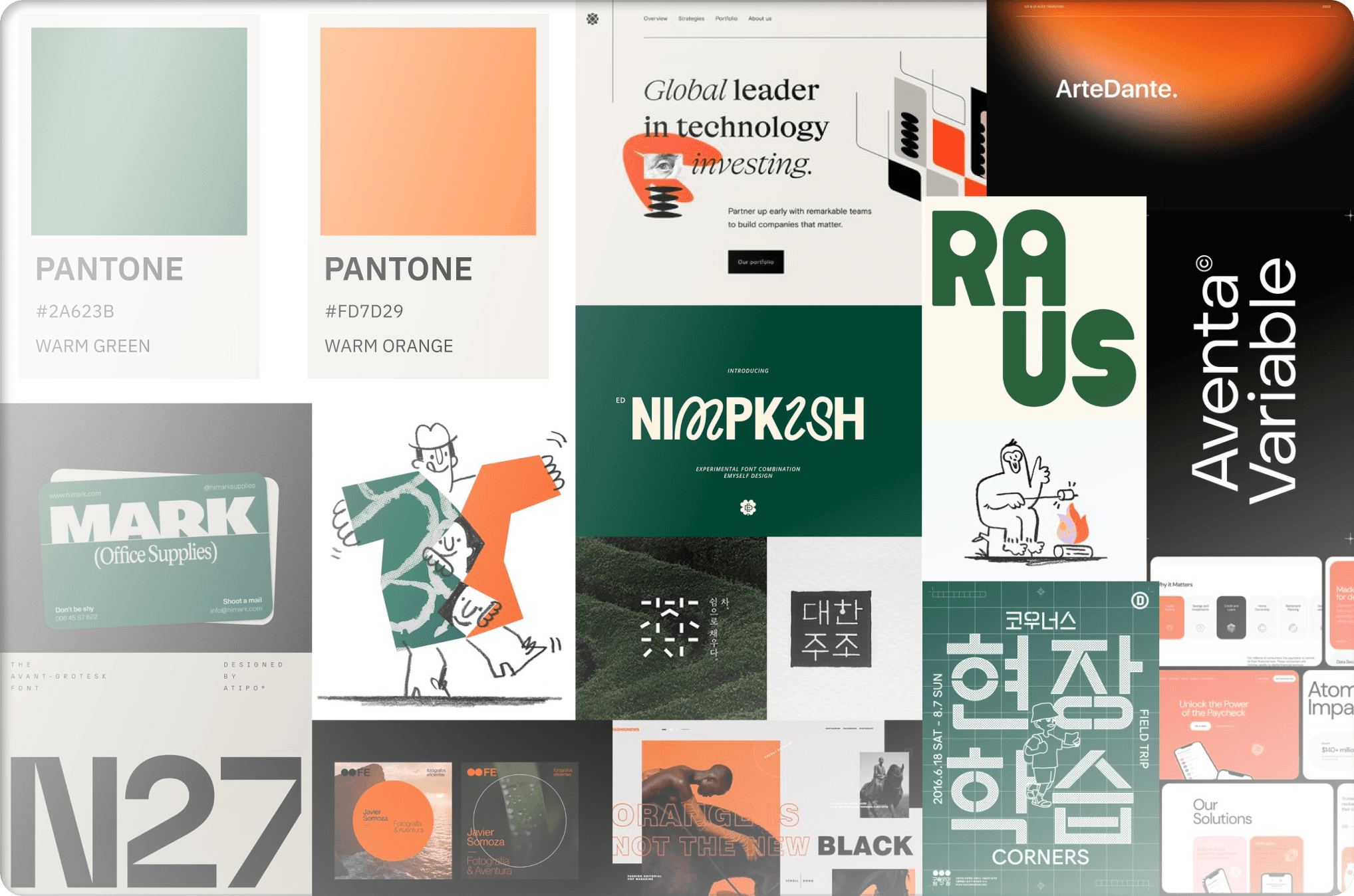
mood board
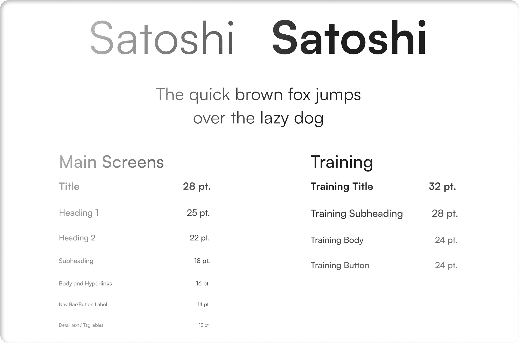
ui typography
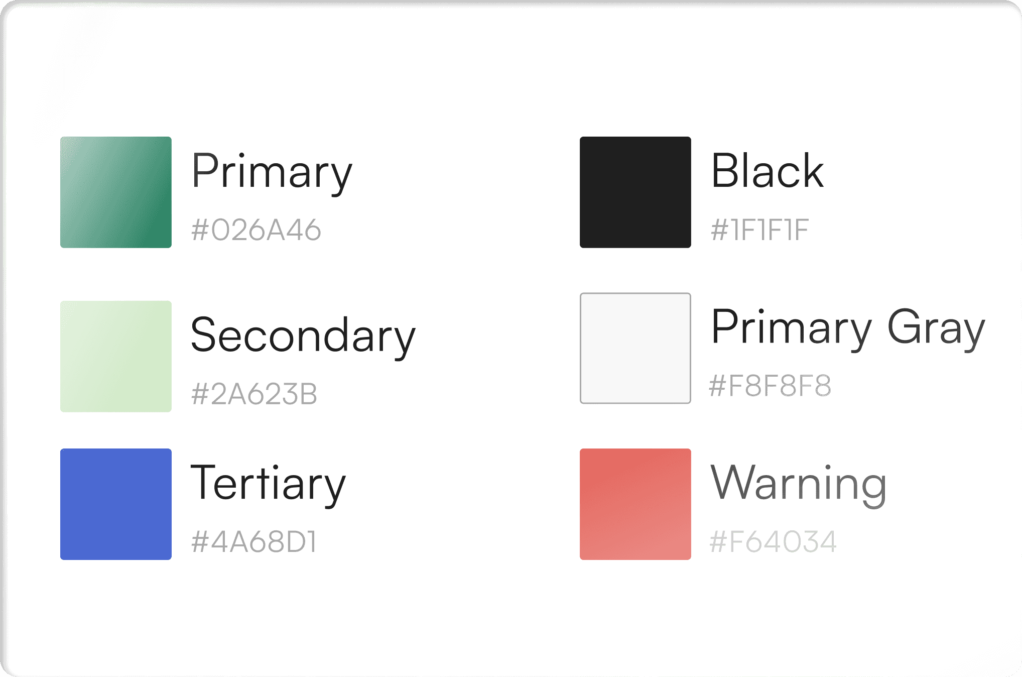
color palette
logo production
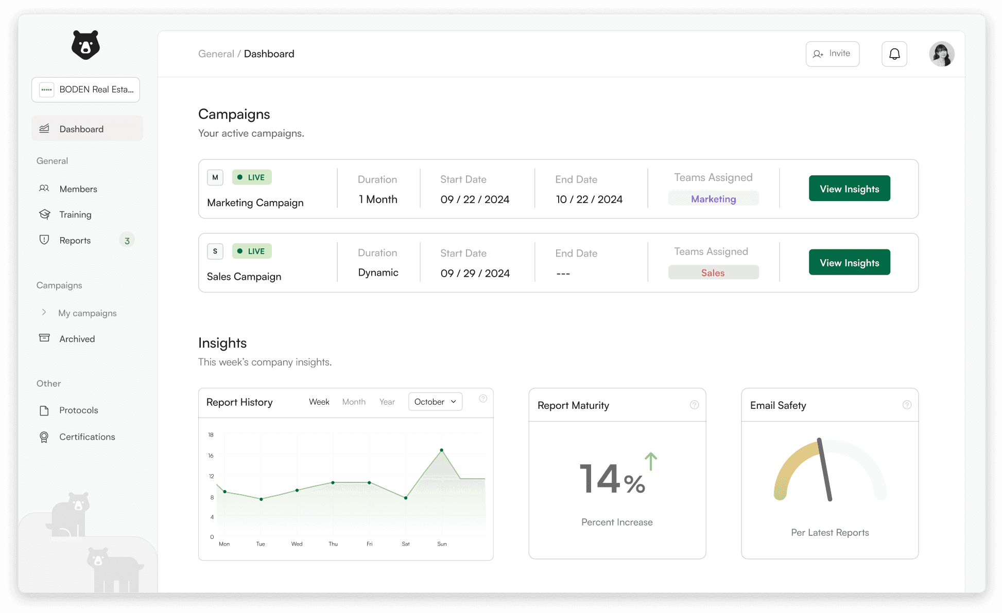
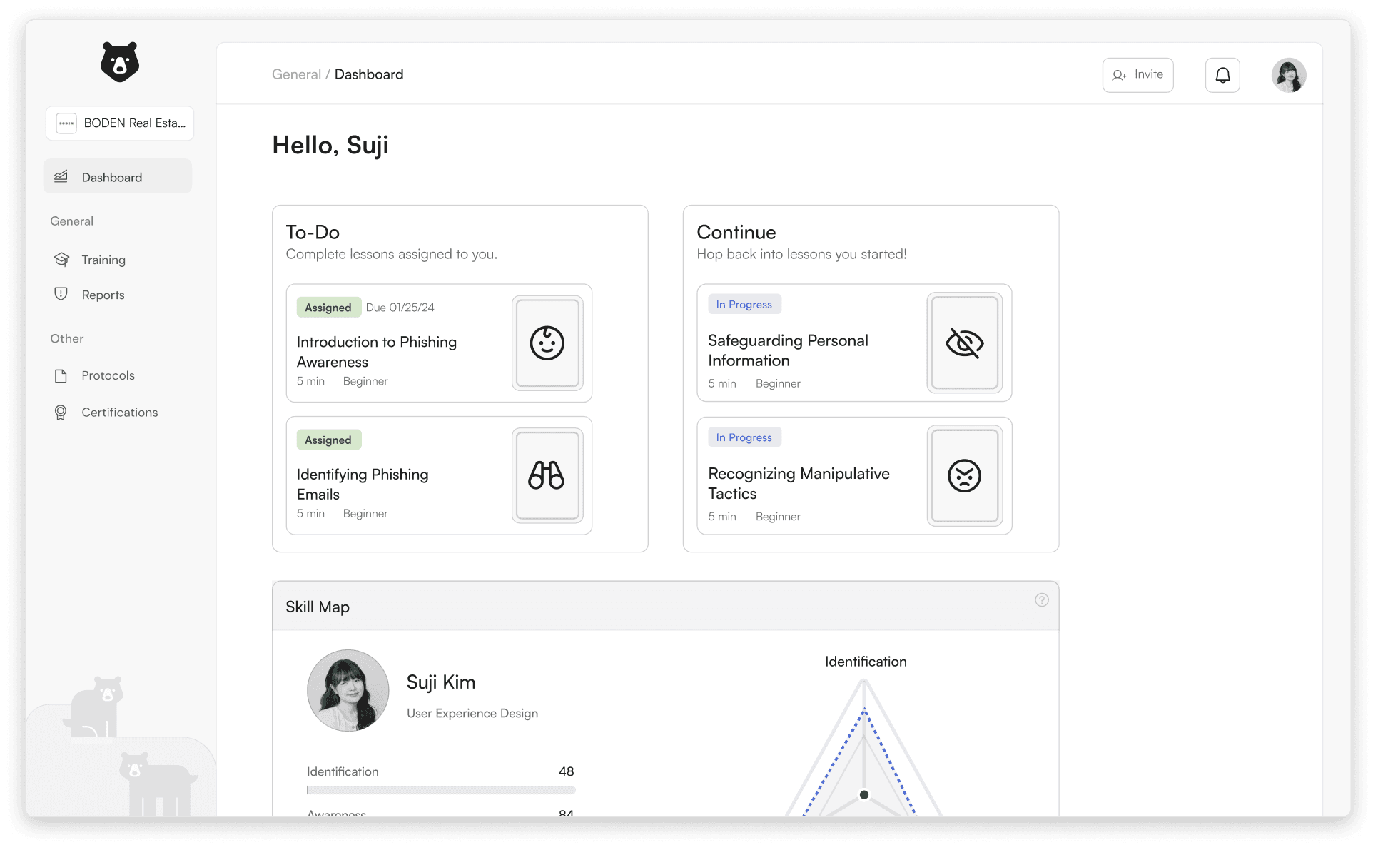
dashboard
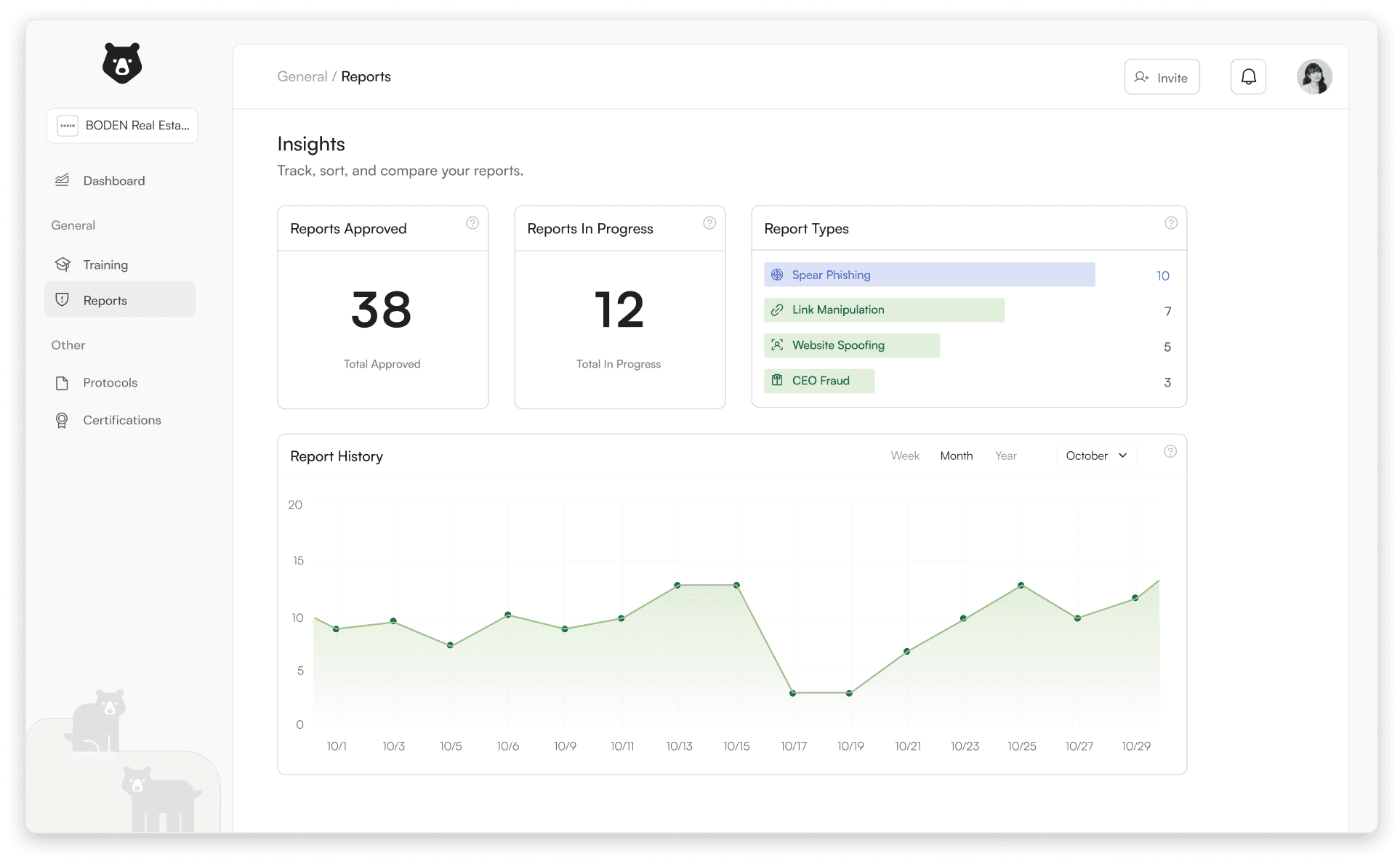
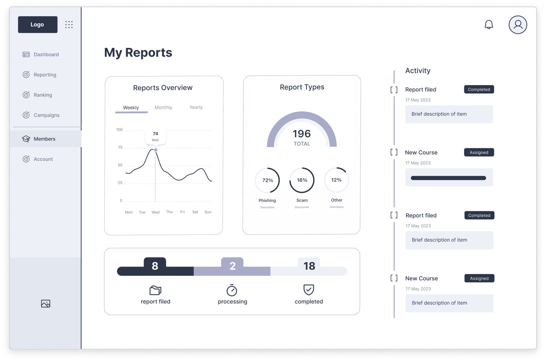
report insights
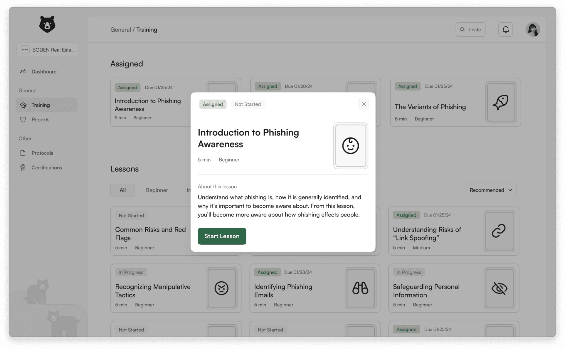
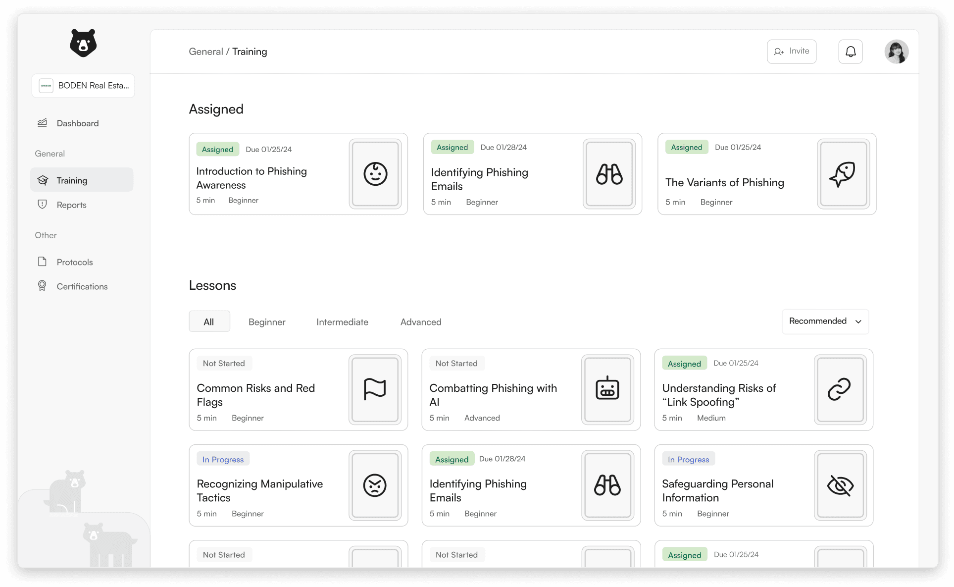
employee training
campaigns
report widget
training modules
We began with three key words in mind: Innovative, Loyal, and Energetic. From there, we drafted colors, images, and typography around the ideas our words elicited.
We conducted a type study to determine our typeface for our UI. We evaluated over 20 typefaces, testing them at different sizes and weights.
inspired by both our mood boards as well as accessibility guidelines, my team and decided an a simple and limited color palette.
We chose a bear as our primary logo. Our goal was to create a simple logo that would be readable at various sizes.
Our landing page starts as the dashboard: a hub for relevant, dynamic information for the user to react with immediately.
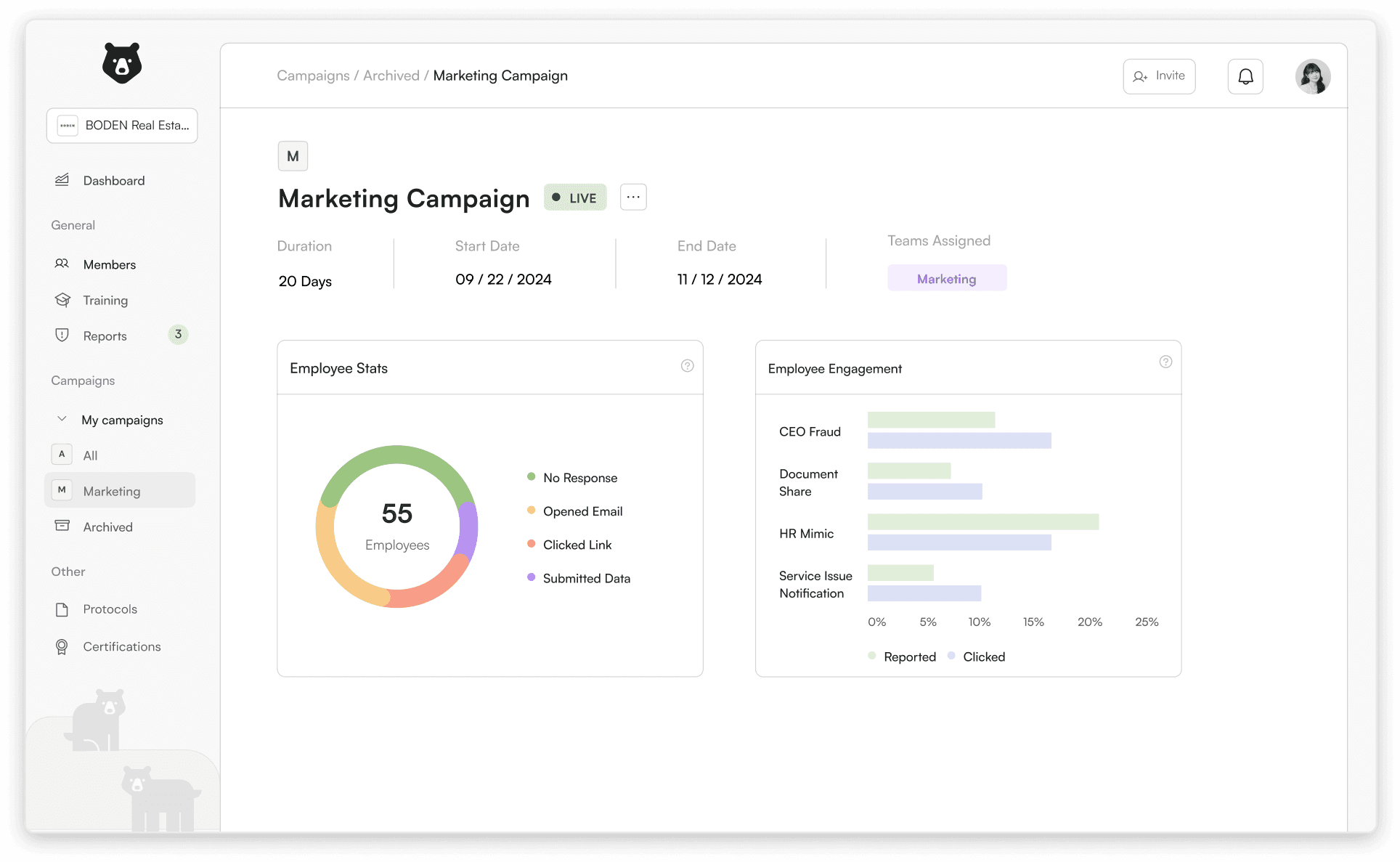
The reports page presents users with a simplified data sheet that updates from the email widget. For owner’s they can view monitor and approve each report. For employees, they can see in live time when one of their reports are approved.
Employees can see which training modules have been assigned to them. They can also view and filter through all possible lessons.
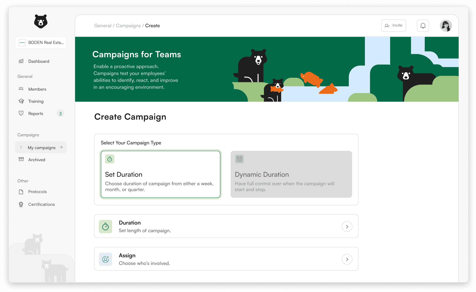
employers can assign campaigns to their teams and select the duration of a campaign, and who to send it to. these campaigns are then sent out to employees inbox’s to assess their progress. employers are then able to see areas of improvement for their company.
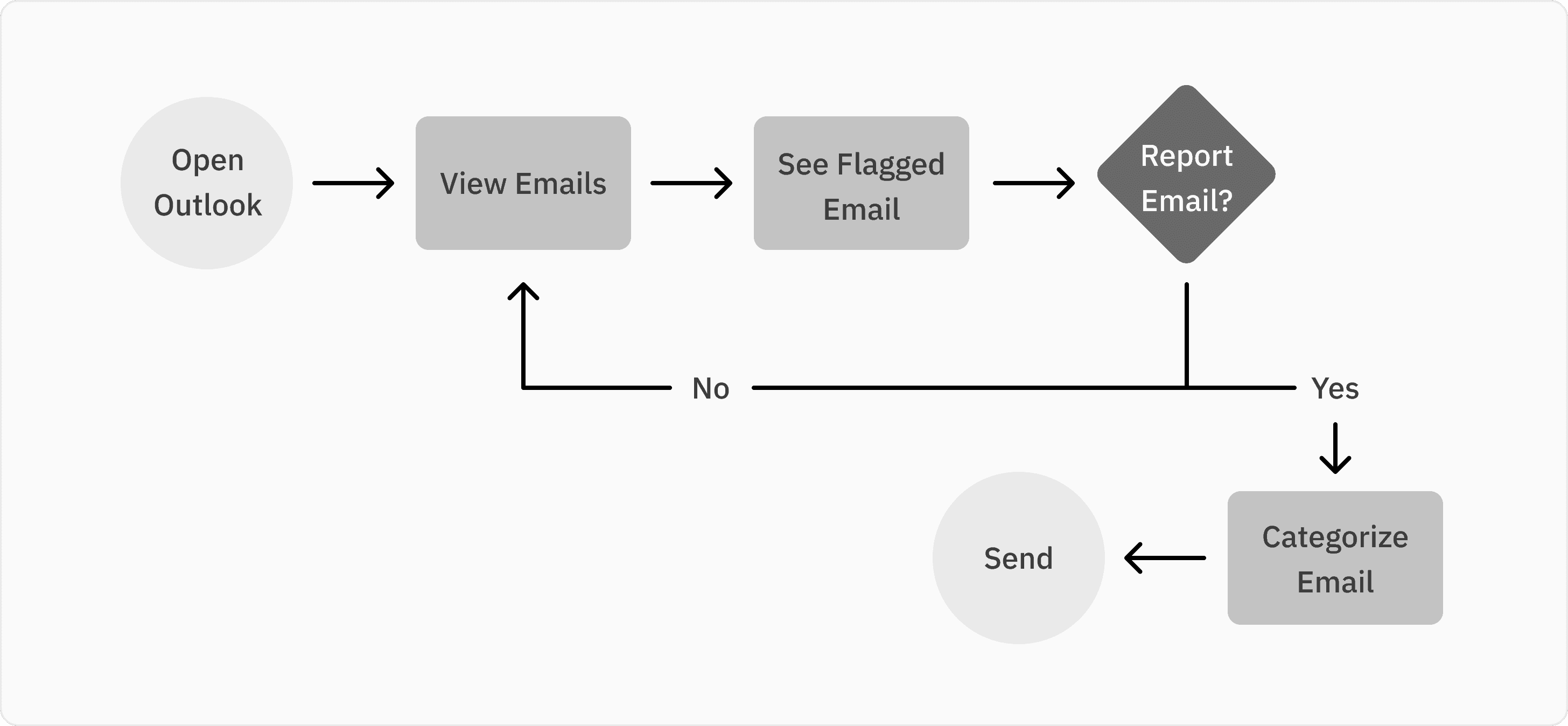
The report widget assists streamlines the reporting process while helping employees validate emails. Employees can learn from there mistakes instead of being ashamed of them.
Employees take engaging training lessons that educates them on phishing tactics and helps bring awareness to what to look out for when scanning emails
employee
employee
landing
assign campaign
inbox widget
question
question answer
employer
employer
lesson preview
campaign review
widget variations
lesson complete
.01
.02
.03
.04
now, our hi-fi designs!


.05
lo-fi’s and usability test
During this phase of the project, my teams goals were to develop a low-fidelity prototype of our product and conduct user evaluations.
as the visual design lead, i had set certain ui goals for how our platform would look when developing prototypes.
We aimed to gather insights from employees and employers to pinpoint key areas for improvement based on their feedback. we conducted 15 a/b tests, 6 user usability tests, and 2 expert evaluations.
i analyzed all of the feedback relating to the visual design and got to work designing the high fidelity prototypes and making necessary adjustments based on the insights,
my team and i began to think about branding. How do we want our company to be seen? What tone should we set with our customers? What colors and visuals can we use to elevate the customer experience?
we also wanted to Fully flesh out our final features and produce prototypes that accurately represent all possible user interactions.
after many, many trial designs, my team and i decided on these as our key screens for the low-fidelity ui designs. with this designed, we moved into usability testing.
simple design
i strived to provide engaging and easy-to-understand content, so by developing a simple UI Design, we will be able to reach this goal.
employee feedback
We were able to interview employees who work in the industry and gain valuable insights into how this could integrate into their work flow.
clear user flows
One key aspect that we noticed in our competitors was their confusing user flows. Having to present so much data to the users, it can be overwhelming. So by developing clear and simple user flow, it will make it easy to comprehend.
employer feedback
Having industry employers provided us with insightful feedback and gave us a better understanding of executing this process with professional implementations in mind.
visual hierarchy
Once we decide on our key feature hierarchy, we then must implement that into our visuals. By creating a clear visual hierarchy with both type and color, it will create an cohesive overall design.
visual organization
Our key takeaway from this round of user interviews was how we could improve our visual communication and provide a clear user journey.
lo-fi prototypes
usability testing
going forward


.04
feature ideation
During this phase of the project, our goal was to develop a low-fidelity prototype of our product and conduct user evaluations
we followed a few steps that allowed us to get all our ideas out:
idea dump
feasibility map
lo-fi sketching
Our team ideated different ways to visually display different features.
We reviewed our Feasibility map to help support which features to focus on.
Each team member made their own ideations of how they think the UI could be visual displayed
.01
.02
.03
user flow development
key features
after mapping out the features we wanted for our product, we started designing user flows for both the employers and employees.
employee flow
employer flow
inbox widget flow
after the ideation phase, we decided on some key features that we thought were essential to our service.
monitoring platform
A desktop-preferred interface that allows business owners and employees to interact with their report history, essential documents, training material, and overall company safety.
reporting widget
An integrated extension that embeds into any email provider via HTML integration. This ensures live tracking of filed reports and campaign simulations.


.03
defining problem space
in this phase, my team and i focused on conducting primary research, building personas, and generating how might we statements.
we utilized three methods of primary research to approach answering this question by identifying our target interviewees: employees, owners, and cybersecurity experts.
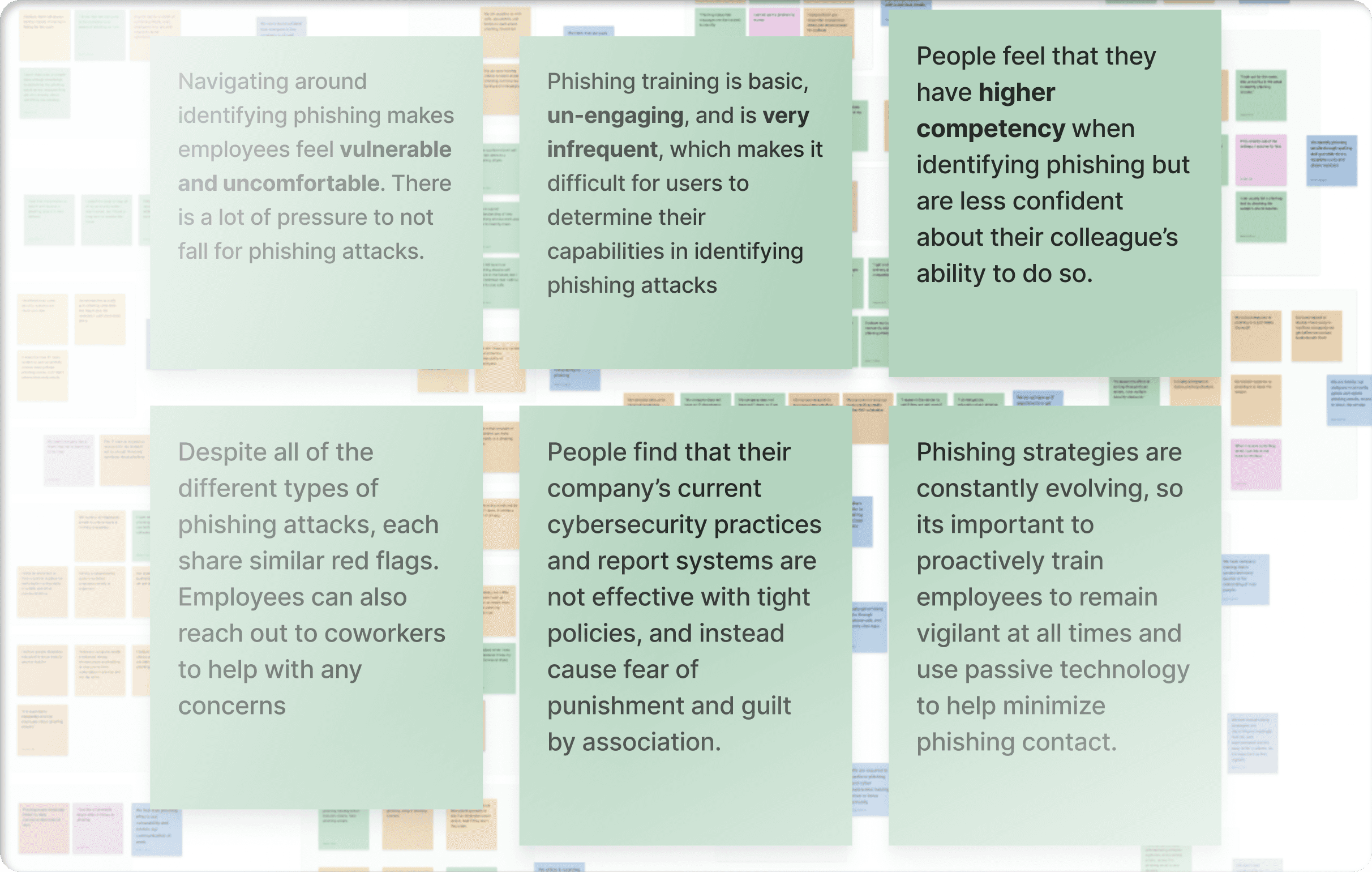
Our team conducted affinity mapping to group similar sentiments to filter common pain points and needs from both employees and owners. We conducted four rounds of affinitization and finalized with six key statements
From our six key insights, we made multiple POV statements that look at the problem from a larger lens, taking in each insight. These would later be paired with our personas to generate new identities behind the perspectives.
the goal of these interviews is to gain a better general understanding of our research insights and quantify our data as well as Connect with a variety of employees from small companies of different expertise.
our 5 w’s
Who is affected by the problem?
SME Owners (client) and Employees (end users)
What is the problem?
SMEs are frequent victims of phishing attacks but fail to report over 70%
of received phishing threats
Where does this problem occur?
Through employee emails and messaging systems received
in office or remotely
When does the problem occur?
When employees interact with emails and other messaging systems
Why does the problem occur?
SMEs view their employees as potential liabilities rather than their strongest assets against phishing.
RESEARCH METHODOLOGIES
RESEARCH consolidation
affinitization
pov statements
generating personas
once having a better understanding of our target audience, my team and i developed 3 primary personas.
after developing the personas, empathy mapping insights from each persona, we developed new POV statements.
once we had our personas, pov statements, and an overall better understanding of our problem space and target audience, we finalized our hmw statements.
pov statements
nathan
an employee who has a stressful workload with lots of email communication, and who is unengaged by phishing training, needs a proactive system that helps him take care of phishing detection and reporting because he wants to focus on his tasks and be productive.
maya
an employee who worries about their security , needs confirmation and communication of trust that her reports are effective and will not negatively affect her because she is fearful of her vulnerability in the company and as a potential phishing victim.
olivia
a manager who sees her employees as potential liabilities to the company's safety, needs a trustworthy, reliable system that can aid employees with proactive and passive solutions, because it increases the company's safety and reduces workload.
how might we statements
Engage employees in phishing awareness without distracting them from their priority tasks?
Alleviate stress of navigating phishing reports for small business owners through a more simplified process?
Make the process of conducting phishing reports more approachable to increase employee confidence?
user survey
user interviews
Subject matter experts
25 participants
12 interviewees
2 interviewees
results showed overall that over 60% of employees have some form of a cybersecurity program within their company. But out of the 60%, only 40% are actually satisfied with the training they receive.
We organized hundreds of data points ranging between employees and owners. The data was consolidated for affinity-mapping and each sticky was grouped based on similar sentiments.
All insights generated from the session were separated from our affinity-mapping process to be later grouped and reflective of our HMW statements.


.02
research phase
my teams goals in secondary research findings was to identify pain points, current market trends, and discover our target audience.
Not every small business applies to our problem space. So, in this case, we defined our audience to be the archetype of “inquisitive”– those who function in a business that is more technology heavy and have higher level of concern for company safety.
our key business strategy consisted of 3 components. first, reducing risk by increasing the company’s ability to report and identify phishing attacks. next, increase ROI by collecting meaningful data that can, in turn, create more effective training solutions. lastly, maintain compliance and Demonstrate your company’s efficiency and safety by state and industry-regulated and recommended compliance measures
we are looking to develop a basic interface, personify our target audience, and further define our target market.
Small businesses are the most frequent victims of cyberattacks, But only 15% of attacks go reported.
overall finding
defining our audience
business strategy
going forward
key findings
Phishing is the leading attack against small businesses by over 25%
70% of small businesses are unprepared against cyber attacks.
Phishing or ransomware attacks occur every 11 seconds.

.01
initial ideation
Our focus initially rallied behind the idea of cybercrime, based on personal sentiments, but continued to research further into other quadrants of security that we felt connected to.
Our team decided to focus on phishing and began to narrow the problem space to focus specifically on small businesses, which are the most detrimentally affected by attacks. However, we still needed to understand why small businesses face these staggering numbers.
.00
overview
how might we...
How might we create a cybersecurity framework that builds employee confidence in identifying and reporting phishing threats while fostering trust for business owners?
PROBLEM STATEMENT
Only 15% out of 3.4 billion phishing emails are reported, with the other 85% putting small businesses in threats.
OUR SOLUTION
Create a platform that helps small businesses become more aware of phishing threats.
our process
discover
define
design
deliver
secondary and market research of topic
persona development and user interviews
low fidelity designs and design analysis
finalize hi-fi designs and brand strategy
The course this project was for explored the physical, psychological, and behavioral characteristics and humans. Our goal was to apply these concepts and develop a usable, desirable, and effective product in a 10-week time frame.

Ursa
a desktop application that enhances phishing awareness in small businesses
product design | fall 2023
timeline
10 weeks
team
sejoon kim
my role
visual design lead
brand strategy
tools
figma
premiere pro
skills
human factors
info arch
design system
suji kim
owen hudock
belle duffner